
Thursday, 12 December 2013
My Inspirational Text For My Contents Page
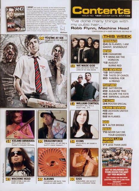
This is my inspirational text, I tried to make my contents look really similar to this Kerrang! contents page as it is similar to what my magazine is like. After completing my survey I knew that Kerrang! was the most popular Rock music magazine with my target audience so I knew a popular layout would go down well with my target audience of teenagers. I put the masthead in the top right third like the Kerrang! cover. I also used the same colour pallet of black and yellow as it fit with the genre really well and the colours were really bold so stood out, I also used some red and whites too as these made text look really good and stood out too. I placed the puff in the bottom right third like Kerrang! too as it looked really good here and I wanted to try an copy the layout as well as I could. I made the editors note in the top left third and the essential info in the top right third just below the masthead too. I made the layout similar too as I put the articles in a grid type style and also made it messy too as my target audience like this style.
Subscribe to:
Post Comments (Atom)
No comments:
Post a Comment